Jade
Jade is a peer mentorship app that allows students to get on-demand help with a touch of a button!
Jade App Homepage Redesign
Role
The team consisted of engineers, marketing leads, and a designer. I was the primary designer and worked on it from an end-to-end scale.
Tools
During the course of this project, I used a variety of tools. These tools were Sketching Paper, Figma, and Google Forms.
What’s the Problem?
Jade aimed to connect peer mentors to mentees through a map where they could then meet up in person and collaborate. However, after the pandemic, the problem space had to be accommodated through a virtual setting instead of an in-person interaction, and in order to solve that problem, we integrated zoom into the app. The current homepage of the app is a map (due to the original idea). The point of the app is to connect users to mentors virtually through zoom so there is no need to see a map on the homepage. This map lead to confusion, some users were wondering if the mentor was going to meet them in person. My main goal is to redesign the homepage and make it as user-friendly and intuitive as possible.
Design Thinking Process
When I started working on redesigning the homepage of the app I needed to empathize with users in order to understand what the problem was. I used it as both a mentor and mentee and realized the point of confusion came from the map because it had no functionality. I then began to reach out to potential users to gain a better understanding of our target demographic. From there I brainstormed possible ideas and began sketching out wireframes and working on the user flow.
User Personas
In order to better understand who we’re solving for I came up with user personas. Through these user personas and the research I had done I tried to pinpoint the users’ goals and pain points.
Sketches & Wireframes
Once I gathered all my research I started sketching out low-fidelity prototypes and wireframes to get an idea of what the flow of the interface would look like. I jotted down notes on what I wanted to remember along the way or just reminders for myself while designing. I really enjoy sketching things out first because it helps get my creativity running.
High Fidelity Designs - 1st Iteration
With my low-fidelity sketches in mind, I began designing high-fidelity designs in Figma and got user feedback on this before I moved on to the 2nd iteration of designs.
Usability Tests
After I created some mockups on Figma I created clickable prototypes for my users to walk through. To prepare for that I wrote a script and scheduled virtual interviews with the users that I recorded that I would later revisit to gain some insight on the product. I had the users narrate what they were doing as they were doing it to understand the way they think and to help me create more intuitive iterations.
High Fidelity Designs - 2nd Iteration
With the user feedback in mind, I began designing high-fidelity designs in Figma and got user feedback again and finally moved on to prototyping.
Final Version
Nothing is ever final in product, things are constantly changing and updating but this is where we landed at the end of this project with the team.
Takeaways & Moving Forward
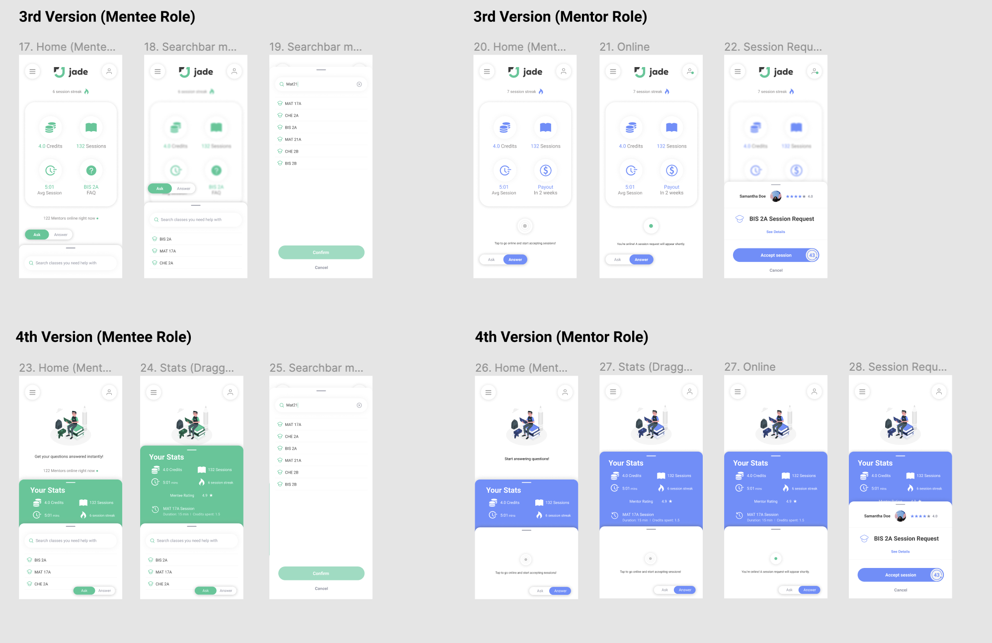
I found that in order to make it as clear as possible I will have to clearly distinguish when a user has switched from a mentee role to a mentor role. I also learned that I need to present “credits” in a way where the users will know exactly what the function of the credits are. I learned that users preferred designs with illustrations and with the statistics presented in an organized minimal way.
Moving forward, I will take their feedback in mind when iterating new versions of the homepage. Conducting user interviews allowed me to understand how users would interact with this app for the first time and it gave me a better understanding of how to design this page. I understood how important user research is in order to create intuitive user-friendly designs.
Human interaction is essential when trying to learn more about your users, having a one-on-one phone call with users and hearing their feedback is the only way to improve your user interface and their user experience.


